Mobile Design: Faster is better, less is more
Published: 5 June 2017
On a typical day, upon waking, I’ll immediately reach over to my mobile phone which is charging on my bedside table. I’ll do a quick run through of emails then head on over to The Age for the latest news. After getting ready, I’ll jump into the car and depending on my mood, I’ll hit play on a podcast, audiobook or Spotify playlist. Approaching the office, I’ll load up the mobile app of a local cafe to “check-in” for the daily special offer. Throughout my work day, I’ll use my phone to communicate with clients. Then, at the end of the day, I’ll jump onto WhatsApp to finalise details of a catch-up with friends. Should I drive or take a train? The Google Maps or Waze apps show me the quickest route while the PTV app displays the time of the next train.
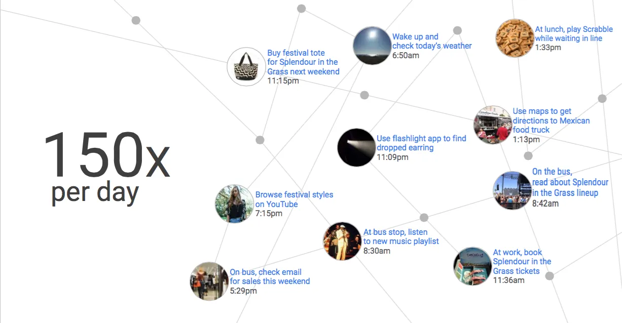
If you think about your mobile phone use, your typical day is likely to resemble this experience. Smartphones are ingrained into our daily lives. In fact recent researchshows that users interact with their phones 150 times on average during a day. Nomophobia is the proposed name for the growing incidence of an anxiety disorder experienced by people who are not able to access their phones. The surge in mobile website traffic over the last few years is hardly surprising and for marketers and business owners, the changing behaviour of customers presents several new challenges but also opportunities.
I recently attended Google’s Mobile Academy and there were a few statistics presented that really stood out. Looking at aggregated data from Google Analytics for 2014 to 2015, there was a 58% increase in mobile conversion rates. Your customers are now more comfortable than they have ever been with transacting on a mobile device. Honda Australia determined that 7.4% of mobile paid clicks lead to dealership visits, while data from Google found that 40% of smartphone users who conducted product research on their mobile devices proceeded to make a purchase on desktop. Your customers’ interactions with your mobile site clearly play an important role in the path to conversion.
The most poignant statistic was that the average time to load a mobile landing page was 22 seconds, yet over half of all mobile site users will leave a page that takes more than 3 seconds to load. This is the biggest challenge facing Australian businesses today. More users than ever are using mobile devices to access websites. These users are highly valuable, generating sales directly or assisting in the sales process, yet if your mobile pages do not load in 3 seconds or less, you’re losing customers and leaving a significant amount of potential revenue on the table.
“...the average time to load a mobile landing page was 22 seconds, yet over half of all mobile site users will leave a page that takes more than 3 seconds to load. This is the biggest challenge facing Australian businesses today.”
Given the growing importance and value of mobile traffic, in this post I will outline the core principles for creating a great user experience on mobile. I’ll also provide a mobile design checklist - a concise list of research-backed best practice principles for mobile design.

Creating Great Mobile Experiences
Content
There are three core principles to creating a great mobile experience for your user. The first of these principles is ensuring your content is optimised for mobile. Mobile sessions are typically shorter than desktop sessions and are becoming even shorter - aggregated Google Analytics data for 2014 to 2015 showed a 7% decrease in time spent per session. This should not be surprising when you think about the context of large proportion of mobile sessions. Users are filling short periods of downtime with mobile browsing. You’re probably familiar with this - you’re waiting for tram or a friend or perhaps like two out five Australians you’re on the toilet and you decide to use your smartphone to kill the time.
Shorter sessions mean your content has to be concise and to the point. You need to prioritise the most important information - use bullet points, simplified diagrams and imagery only where necessary. Make sure that every element on the page addresses the customer intent. Users leave when the page does not satisfy their intent but are delighted when they find what they are looking for quickly and efficiently.
Performance & Speed
The second core principle is to improve the performance and speed of your website on mobile devices. Remember, 53% of users will leave a site that takes more than 3 seconds to load. The probability of a bounce increases by 90% when page load time goes from 1 second to 5 seconds. It increases by 123% when page load time goes from from 1 second to 10 seconds. Additionally, the probability of a conversion drops by 95% when the number of elements on a page goes from 400 to 6,000 elements. The numbers are compelling - faster is better and less is more.
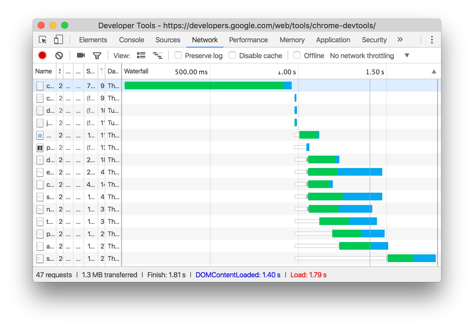
Improving your page load speed might be something you need to discuss with your web developer. A good starting point for looking at opportunities to reduce load speed is to review your network waterfall. This analysis will display the load order for elements on a page and how long each element takes to load. If an element is not absolutely necessary and is adding to load time, you should go ahead and remove it.
Jonathan Marsh, Mobile Solution Specialist at Google recommend the “FLO Framework” for improving mobile performance. Discussion of these technical points is beyond the scope of this post, but a web developer tasked with improving website performance is likely to find the framework particularly useful.
- F - First impressions
- Prioritise download of engagement content
- Progressively load anticipated data
- Use inline and internal CSS and JS
- L - Limit server hits
- Avoid landing page redirects
- Concenate resources
- Leverage browser caching
- O - Optimise Content Delivery
- Compress and select efficient images
- Compress with GZIP
- Minify resources
- Refactor CSS declarations and JS logic routinely
- Optimise server and infrastructure
Design & Functionality
The third and final core principle focuses on design and functionality. Google and UX research company, AnswerLab conducted research with the aim of establishing mobile design best practices. The study collected data from a broad range of mobile users, across both iOS and Android devices, with study participants observed browsing over 100 mobile sites. The research lead to 23 principles of mobile design listed below.
- Homepage & Site Navigation
- Menus are short and sweet
- Calls-to-action are front and center
- Make it easy to get back to the home page
- Don’t let promotions steal the show
- Site Search
- Site search is visible
- Use filters to improve search results
- Search results are relevant
- Guides users to better results
- Commerce & Conversions
- Click-to-call is present
- Users can book as a guest
- Users can explore before committing
- Easy to finish on another device
- Existing information is used
- Form Entry
- Info entry is streamlined
- Uses toggles/dropdowns to simplify input
- Visual calendars used for data selection
- Minimise errors with real-time validation
- Form design is efficient (auto-fill)
- Usability & Form Factor
- Don’t need to pinch + zoom
- Images can be worked in full screen
- CTAs stay in the same window
- Site is clear about info capture and security
- Entire site is optimised for mobile
Homepage & Site Navigation
Ease of site navigation is key to great mobile design and your menus should be short and sweet. Consider using reduced navigation on mobile devices or using two or three main navigational links with a “nav burger” menu for additional, less important links. Consider using a “sticky” menu that remains fixed at the top of the screen as the user scrolls through content. A sticky menu also makes it easy for users to return to the homepage by clicking on your logo.
Your call-to-action should displayed front and centre. It should appear above the fold and be one of the first elements to load. An increasingly common practice is to use a sticky bar with your CTA at the bottom of the screen.
Site Search
Mobile users who need to find information quickly and efficiently will often rely on site search functionality. It’s is important to ensure that this is optimised for mobile users. A good practice is to include a microscope icon in your navigation menu. When clicked, this could take the user to a dedicated site search page but it would be even better if it clicking the icon expanded a search bar without loading a new page.
If you’re an eCommerce store, be sure to provide relevant filters. A shoe store might allow users to filter on shoe size, colour, brand or style. Guide users to better results where possible. For example, think about common misspellings and ensure that your site search can redirect users to the appropriate results page.
Commerce & Conversion
The easiest way to convert a user on a mobile device is to use a click-to-call button. When a user on a mobile device clicks on this button, your telephone number is loaded onto their phone and they are one tap away from calling your business. Make sure the click-to-call button is featured prominently or ideally, as part of your sticky navigation.
Remember that mobile sessions are usually quite short, so make sure your conversions are easy and quick to complete with as little friction as possible. If you accept online bookings, allow users to complete the process as a guest without the need for entering all of their details. Having to enter too much details on a mobile device can be tedious and lead to drop-off. If you have a more complex conversions requiring detailed information, think about getting the user’s name and email and send sending them a link to complete the form on a desktop device at a later time.
Form Entry
If you are using forms on your mobile site, ensure that info entry is streamlined. Remove any fields that are not absolutely necessary. Use toggles and drop downs to simplify input and visual calendars for date entries. There’s nothing more annoying than filling out a form on mobile and hitting submit only to receive an error message that you’ve incorrectly filled out a particular field. Use real-time validation so that users can correct issues as they progress through the form.
Optimising forms for mobile is an art form and I could write a post on this topic alone but thankfully there is already some good coverage.
The Accelerated Mobile Pages Project (AMP)
A discussion of mobile site optimisation would not be complete without mentioning an emerging technology that is reducing the gap between mobile app and website performance. The Accelerated Mobile Pages Project is an open-source initiative backed by Google that allows content to be loaded faster on mobile devices using a “stripped down” version of HTML. At the time of writing, AMP has been adopted on over 1.7 billion pages, so perhaps it can no longer be described as “emerging”.
For early adopters of the technology, there have been some extremely positive results. The Washington Post saw a 23% increase in returning users from mobile search after creating AMP versions of their articles. Users were no doubt delighted with an 88% improvement in load time compared to the traditional format. Another company, NoBroker, saw a 10% increase in pages per session and an 18% reduction in bounce rate since adoption.
While AMP is not officially supported by Google AdWords, some savvy advertisers are using the technology to create AMP versions of their landing pages and have seen strong improvements to conversion. This of course makes sense - faster pages means lower bounce rates and a higher likelihood of a user completing a conversion. If AdWords were to add a visual icon besides ads using an AMP landing page, CTRs are likely to improve which is a win for advertisers adopting the technology.
Faster is Better & Less is More
If there is one key takeaway from this post, it’s that when it comes to optimising for mobile, faster is better and less is more. For most businesses, the majority of website traffic in 2017 will be from a mobile device. These users are ready and willing to transact with your business. Regardless of the quality of your product or service, if your site does not load quickly or is too complex to navigate, you are losing customers. If you want to succeed, you need to take steps to ensure a great mobile experience for your customers.

James Richardson
Co-Founder
James Richardson is one of the co-founders of Optimising, that he started in 2008. He's spent nearly two decades helping Australian brands get found online, from technical SEO and platform migrations through to AI search.
Outside work, he's usually on the basketball court or golf course or being comprehensively outsmarted by his three daughters.


